to bright? sry i tired to make it look cell shaded
no r_h…the ones on top would be too bright…
super bright
old

new
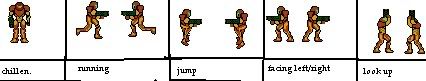
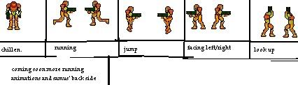
when enought ppl think ther good i’ll make a complete sprite sheet with lots of poses…alot of which you dont even see samus in in all the metroid games
ima noob… whats cell shading?
In which each section is colored in one shade of color, nothing more.
yeah…what gold leader said…also … wind waker is a great example…any thing i should improve on with my latest recolor of my sprite sheet? i wanna get on to making a full one
while i think the new colors are closer to being right, the old colors looked way better for cell shading.
Oh, no. That’s not the problem. Why is the lighter shade yellow, and the darker shade orange.
Yellow
Dark yellow
The legs shouldnt have any orange on them, they should have a darker shade of yellow.
well this is my samus not nintendo’s
claps
that takes some balls to say!
lol
well heres the newest colors…
how is it? btw im gonna make a cell shaded sheet too cuz it’s my favorite one
any new color schemes suggested? if you wanna suggest one just fill this out
visor-
head-
primary color-
main color-
arm cannon color-
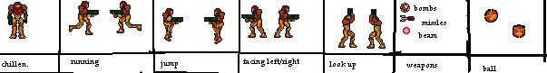
new poses and weapons. the missle is just a recolor…i made the lines on the ball thick cuz i noticed other ppl did and it looked better and it has shine…im gonna start adding shine to all of em and then im gonna get about 3 more running poses…yeahh…
edit: im seeing alot of people saying recolors are usless and do nothing…well i started off recoloring m2 sprites
yeah, but its still just a jpg…
XD
fix that, or, like i said earlier, IT WILL COMPLETELY RUIN YOUR SPRITE!
best formats for pixel art : bmp, png, and gif.
k any comments on the sprite its self
looks good!
although i dont like the thick outline idea
and, it needs more running frames.
The ball isn’t a perfect circle, I’m not sure if you weren’t trying to make it one or not, but it just doesn’t look very good to me.
As for the body, I kind of like it, it has sort of a cool unique style about it, hard to explain. As far as criticizim goes though, maybe try adding some more colors for shading, and the arm cannon looks a little square to me, try rounding the end a little.
EDIT: And yes, more running poses. ![]()
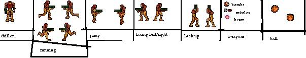
YES I DID IT I ADDED NEW RUNNING POSES its still not enough tho. im gonna add ones of the other leg going up
Wow…kinda sloppy organization. Whats with the shading on the bottom left running animation?? And the legs on the bottom right look like they’ve been filled with silicon.
k the suit idea was sorta like moving around all the time on samus…but ur right i sorta over did it…the idea was an x and varia suit have positive effects for once
if you’d like to make the animation not as sloppy, you should make it at least 8 frames.
if u look in my spriting topic, theres also a really good pallete for the legs in each frame you could use.
Actually, when i said sloppy, i was referring to the weird black lines on the page, and the crappy morphball outlines. They have a circle tool in paint for a reason.
Srry, didnt mean to be mean.