Yeah.
If he were called Betbo
And yours wasn’t? They’re supposed to have filters it’s how you make them not suck.
That being said, the Pixel one was just some mouse-drawn text with a bunch of noise, then the Predator effect in GIMP. That an a bunch of other minor edits. And then hue-change.
This entire forum is an embarrassment to signatures. No offense, guys.
…
Please tell me that’s sarcasm.
You’re supposed to focus on brushes, actually, RetroX.
In your defense, you used filters very tastefully, and I like most of it. The neon glow one kinda sucks, but http://64digits.com/users/RetroX/Swirled_B…Logo_RetroX.png is pretty cool. ![]()

New sig. Yes plain. No care. ![]()
But can someone make the black (including text) transparent? If so thanx.
Transparencies tend to shoot the filesize up a bundle. Your quality’s pretty bad, too–looks quite JPeg’d, so it might have artifacts if transparentized. Correcting that might take it over the limit.
Not saying it can’t be done, just a warning. ^^
Anyway, I’d give it a shot, but I haven’t, erm, bought Photoshop for my new computer yet. >.>
His av is over the limit anyway >_>;
It is?
I don’t know how to check…so yeah. >_>
it is a sort of a work in progress because me and a friend may be getting it to animate
nt bad not bad at all but i must say theres much negative space in your work negatie isnt bad but theres a lak of positive and there needs to be an equlilibraium between the 2 as they both shre a artistic mutual relationship. black text is a bit hard to transcribe too.
well it was an image that i found on teh interwebz and cropped, as far as the text is concerned i can never find a good colour to use
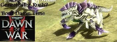
(for the record i am fully aware that that isn’t a genestaler but the joke lies in the fact that zerglings are based off of the damn things)
totally rad, are you typing with your flippers? Can you make your stuff more legible? Some of us aren’t master deciphers.
New Shinedown-Based Avatar. I like it, and for anyone who cares, that’s the cover for their newest album, the Sound of Madness.
Eh, started playing around again, now that I finally reinstalled photoshop.
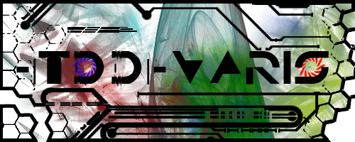
TDD would be my Counter-Strike Source clan, and varis… well, duh <_<
Mostly a test of a few brushes and such.
This background color doesn’t do it much justice, to be honest. It’s meant for a darker forum, and looks a little more bland here.
I <3 it.
Can I have one?
lol, sure, I’ll see what I can do for you.
Send me a PM or something with the specifics sometime.
Although it’ll be a lot smaller if you want to use it on these forums <_<
(Told you mine was meant for other forums, mine’s twice as tall and almost twice as long as is allowed here, lol.)
Edit: Alright, here it is… to the same general effect as my sig:
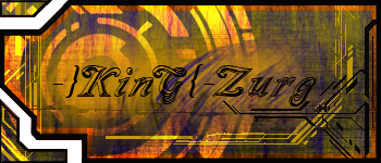
Hopefully you like it, Zurg =D I can always fiddle around with it more, too. I might just make another one altogether.
…or I might change a layer or two around, we’ll see.
It’s Beautiful!!!
![]()
<3
Edit:
![]() it’s 11 mb too big for the clan site…
it’s 11 mb too big for the clan site…
11 mb?
lol, ouch.
I’ll see what I can do.
Edit: OH, 11 kb XD
hm… little different.
Anyone wanna help out with compression? I’m a little tired, not thinking about it clearly.
sure, cloud.

27kb, a slight loss of colour, but nothing noticable.
Actually knowing the size restrictions WOULD have helped, though, zurgy <_<