Well… The circles are’nt round. So I edited your image.
They should be round now.

Well… The circles are’nt round. So I edited your image.
They should be round now.
whoa! you hack. thanks so much for coloring for me. nice color scheme.
well, ive been cranking out another tileset very mechanically (and unexciting)

the second one is supposed to be a wall… looks kind of like 1, well, a very sad attempt at 1 anyway.
back with crag-like dirt.

when do you yourself plan on using these sprites?
well, i keep getting game ideas in my head, and i really want to make a rts, but i really dont think im that experienced with programming and such to make an rts.
Which brings us back to this question.
There’s probably some kind of gamemaking forum/community that could use these kind of customs though. Or you could go and sprite for a fangame.
i hate to bump this topic again… but…
POWER SUIT EDIT ZOMG!

you’ll also notice that i got rid of the GF suit in the “4 suits 4 ways to kill” section and added an addition i call the mercury suit. the suit’s design is derived from some artwork i saw on the forums by… edthedestroyer. also, i will be (hopefully if i can do some programming) using these in a fangame! also, i tried to add a little color to the mercury one by making the chest plate blue. tell me if it looks out of place to you, and i’ll make it gray.
also added spinjump poses!
thx for not replying… jerks
in other news…
crystal suit

also switched chestpiece of mercury suit back to grey.
what can i say? i was inspired (mostly by daz) =3
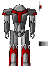
marine

i know, i know, its small… but expect something big from me really soon
Reference Image
zealot

wow… i was working on a monitor with a bad resolution setting… i just noticed how bad the contrast on that one is…
Reference Image
note - i know the zealot is small compared to the marine but i didnt have the marine sprite with me at the time to work off of. i will completely revamp it hopefully.
edit
this better for the zealot?

oh wait… the abdomin looks dorky now…
Wow, im suprised nobody’s replied. All you’ve crank out is dope stuff lately. Almost makes me want to start spriting again…almost.
hererah is some updated crap…
i realized that the marine reference i used was not actually from starcraft, but inspired by starcraft…

ref - http://model.otaku.ru/images/marine01.jpg
better or worse?
updated zealot

same ref
thanks for the compliments, although half the time i dont think i deserve them. although they look good as a whole, i always find little faults with them, such as the abnormal abdomine… at any rate, i think people have gotten tired of my style, and wont comment because most of my sprites are so similar in style.
remember - a large sprite is hopefully coming soon. i want to suprise you so i wont tell you what it is =)
boo!
scared ya?
anyway, say hello to this scary creature
Zerglin’

ref - http://www.warbucket.com/dump/news/dv/zergling.jpg
again, i was working on a computer with bad resolution so i couldn’t really take a good look at it. the thing coming up in the back is the tail, so… enjoy.
remember to post critique and questions!
…ye gods, what have you done to my poor Starcraft?
The marine’s way too thin, his shoulders are incredibly tiny, his arms are too short, he’s pillowy, his limbs are too segmented, his kneecaps go way too far in below them, the helmet is too square, and it lacks either the shoulder lights of the SC CG design or the back tank of the SC sprite/Ghost design.
The zealot…the proportions, man. Nuff said. Also the contrast and utter lack of details.
I couldn’t even recognize the zergling, and that’s saying something coming from the biggest 'ling fan I know. It just feels flat, and the limbs are all too scrunched together–also too long, as the head is way too high off the ground. It’s also the wrong color. The scythes are way too short. And the feet are all blobbed together. And he SEVERELY lacks proper contrast.
In general, they’re extremely inaccurate, very disproportioned, poorly colored, flatly shaded, and in general… yeah. Nuff said.
I’m sorry. Contrary to popular belief, I don’t like giving such negative comments on sprites. But I can only say “on the bright side, __ is good” if there’s a bright side at all.
Plus you’re working from three different sources. Your Zealot uses the SC CG design, the Zergling uses the Ghost CG, and the Marine uses a fanmade one based off the SC sprite. You should really stick to one design style for a set.
Your Samuses were pretty good, so I know you can do better. Try and do some justice to SC next time, eh? :3 Don’t get discouraged by this review, just learn from it.
woah… i just took a look back and found out how bad they actually were >.<
oh well, you have a nack for detail, im sure ![]()
at any rate, i’ll get to work on those problems right away. i took another look at the starcraft start screen zealot and my sprite looks perfectly perportional to it, at least as far as i can tell… the body is supposed to be tiny compared to the big, bulky armor. what kind of details are you refering too? the sprites are simply too small to incorperate every little detail, and by the detail i see on the screen, it looks fine to me. The contrast is lacking, i know… in fact, i had a previous pallet that i used that was even less contrasty =/
now that i take a second look at the zergling, i know what you mean… xD i’ll probably have to completely revamp it. i’m supprised you didn’t notice the pillowyness on the body… because it is pretty noticable… lol. i’ll add texture to help with the detail of the torso. when you say the head is too far off the ground, do you mean i should, after i shorten the legs of course, lower the head in proportion to the abdomin? too pinkish of color?
as with the marine: pillowy? i defined a lightsource… can you explain what makes it pillowy cus, from a shading standpoint, it looks fine to me. the shoulders do look a little small on second thought, but not by more than a few pixles… i notice what you mean by the short arms. helmet too square? i’ll try better on it… there was a shoulder pack on the marine? i never noticed that.
on another note…

i have no idea how to dither such a mosterous size… any help? i wish butch were back D=
at any rate, if you could link a website to a starcraft cg design, daz, it would help, because thats what i was trying to work off of but there was simply a lack of images on the google search.
Units: http://www.blizzplanet.com/coppermine/thum…s.php?album=106
Vehicles: http://www.blizzplanet.com/coppermine/thum…s.php?album=107
There’s a mishmash between SC CG and Ghost renders in there–generally, black-and-white or low-res color are SC, and the rest are Ghost.
The big marine is an improvement, but his shoulders are WAY too small, and his thighs pokhe out awkwardly. Also, the facemask shouldn’t take up the whoel front of the helmet. And he just generally feels a bit stiff.
The shading is fairly good though. Better than I could do in that style, to be honest, though I suck at metal anyway, so that might not be saying much.
I agree with Daz on the shoulders. . .they are a bit bigger than a space marine’s
You could always try something like this:
It’s the easiest way to do it.
hey! butch is back!
i know i should probably stick to the basic dithering method, like your showing on there, but i really wanna try something a bit less systematic, like the dithering you used on the face in your topic… any more help would be appreciated, like explaining how you decide which pixles to dither and such…
new shoulder pads, helmet, and upper legs… yay or nay?
oh wait, i forgot to color the area on the helmet darker… oh well.

is that pad on the right big enough?
once i finish the dithering on this one, i’ll go ahead and revamp the other starcraft sprites…
oh… thats right, i forgot to add the lights on it. oh well.
edit

added lights and tried to fix helmet…