I really cant see why people keep complaining about weavels color. He’s green in the official Nintendo’s official art, and its so damn hard to get ingame shots. Cut me some slack on that. I could also use some ingame shots of sylux and Noxus. No complaints on kanden? Anyway, ive updated them a little. I repost them once they improve more.
Metroid official art is almost never accurate. Weavel’s color is totally off, and even then he’s one of the most accurate of them all. Ever seen Prime’s pirate concept art? COMPLETELY off in EVERY damn way. Official art is NOT to be taken as the final design except in a few cases. And again, Weavel is silver.
And I don’t think Weavel wears high heels <_<;
lol.
anyway, i really like the recolors. a little suggestion though is that you could add color tables (its what dazzy [and most other ppl] does and he = teh 1337 spriter)
you should redo the whole sheets (i know, sigh) and add the recolored version on the sheets
EDIT
i would also like to point out the between weevils joints, its black. I should know, i put them all in paint and made a black background to see how it would look, and turned it back to white and (low and behold) weevil’s joints were gone! NEVER PUT BLACK IN A FUCKING SPRITE! dazzy has said it millions of times and (cus he’s leet spriter) you should listen to him.
>_>
Thanks, but “cuz hes a leet spriter” is hardly a reason to do something. Of course, I luckily know the reason, so I can give him a real reason. ![]()
In real games, aside from NES, solid black is never used. They always use a dark purple or a grey, or sometimes darker shades of the color of the piece you’re outline. Black is usually reserved for transparency.
…
Hm. Actually, I’m not entirely sure why they do that. But most game making programs have black as the transparency color, and since no real games use solid black (save 8-bit), you shouldn’t either. Or something. <<;
Shadows and dark places aren’t black in the real world, so why should they be black in a game?
(dark) Green, purple and brown are the best colors to use.
Dark gray for the win.
In paint, just put in something along the lines of 7-7-7 for the RGB value, and that’ll give you the darkest gray that isn’t black.
The reason I don’t use black in sprites is cause I use DarkBASIC to program, and that, as Dazzy said, defaults black to transparent.
Nevermind that, I lied. The real reason is cause I was taught spriting by Dazzy, and he taught me from day one to use darker shades of colors for outlines. Plus, you’ll never really need black… In a light sprite, it makes too much contrast, and it a dark sprite, it creates too much dullness. Whenever I use gray in sprites, I always tint it one way or another (usually blueish gray) so it looks better. You can’t tint black, so it’s always boring.
Plus you always want the outline to be softened against the shading, so you should use a dark version of the shaded color, unless you’re going for a super-ultra-cartoony effect.
Thanks for all these great tips. I havent apllied them to these sprites, but i dont feel like finishing them, and im posting them. Here are my plasma pirates. Constructive criticism please.
![]()
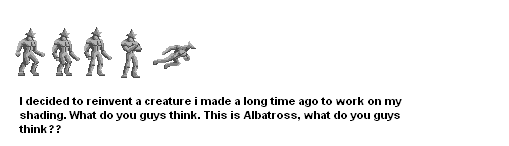
Here however, ive been working on an original character. Ive done a few poses for him. Id like to know what you guys think. I mainly redid him to work on shading, and original poses. Constructive criticism also.
I like Albatross, actually. The best of your creations, IMO.
He’s still missing a lot of things, but overall, he’s okay.
Pretty sweet, actually! The shading is unorthodox, but it’s just a new style moreso than bad. You’re getting better. And I like the design. Needs a bit more detail I’d say.
Ill try to get my brother to help with the shading. I started him off 1 color to work on shading directly, but ill try to make him more interesting as i progress. Im still working on more poses for him, ill post them as they come.
Double posting, bad, thanks for making me do it. Anyway, here are some of the updates on my character, Albatross.

Ive come a long way from that black outline stuff. Tell me what you think of the shading.
That looks cool, I may make me a custom creature.
like the pirate version =p
Space pirate? It wasnt the idea, but im glad you like it. Anyway, ive taken a quick break from albatross to sprite one of my favorite creations. First, he was in my head for months, and then, he was on the same piece of paper for a year. But now, he’s been sprited. Hes called mergris, i hope you like him. I feel kinda stupid saying so, but he means alot to me.
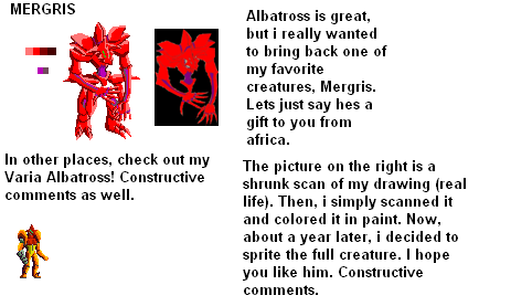
In other news, i did a VariaAlbatross for fun. Hope you like that too. Constructive criticsm please.
Very Unique, that creature is great but I think he needs more shading try a darker red and brownish red.
Thanks for only 1 reply. I did some recolors on my sylux sprites, since i felt they were the most accurate. What do you guys think, toomuch, not enough contrast. I thought it looked a little too pixelated.

You’re getting a LOT better. The side view looks pretty decent, but the front view chest is really weird and the head curves awkwardly.
Are you editing colors at all? You seem to be using entirely default Paint colors. Double click a shade and you can change them. You really shouldn’t shade dark blue with light green like that… <_<
I thought about the green, but assumed since the lights on his body glow, it would be okay. But i can see the problem, and ill fix it right up.