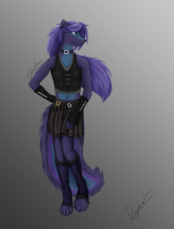
This is quite good, but it reminds me a lot of some other artists I know that know how to draw, but their drawings land somewhere in the uncanny valley in such a way that many parts of them look misshapen and flat. The pieces are all right, but they don’t fit together. The first one’s a good example: would the hands of anyone who was holding 100 pounds of dead weight have their fingers crushed together like that? Look at the angle his left wrist is apparently at. It looks extremely uncomfortable.
They’re good, and I don’t want to say I’m a good artist or anything (I can’t draw stick figures properly), but if you wanted to improve I’d suggest paying closer attention to the mood of your drawing and drawing more emotionally/less logically. I think you get these bizarre shapes cropping up because you’re not creating the image as a whole, but rather organizing the pieces and then drawing each one separately. The hands in the first image look almost copy-pasted into it. Try to make all the parts flow together better. It’s much better to stylize your art than to have a jarring misrepresentation of realistic figures
Yeah, I’m aware the hands in the first need working on, but I was so frustrated with them I didn’t really give a damn. : / I just threw those together honestly because I was too frustrated with them. After that image is when my art started improving more, and I can draw hands and anatomy better.
What Tim said, only I think you need to draw less emotionally/more logically. The reason parts look misshapen and flat is because… well, they are. I know it sounds really fucking obvious when I say “you need to think of what you are drawing as 3d at all times” but that is what you need to do. That means when you are working out the pose, draw all sides of the shapes – not just the ones you can see. It’s annoying but it will help you position things like the hands which also have to be treated as 3d objects.
Opinions? I haven’t drawn much as of late; loads of reallife shit has been going down. Finances. Homelessness shit. College. More and more. But I’m trying to get back into drawing since things are looking up again.
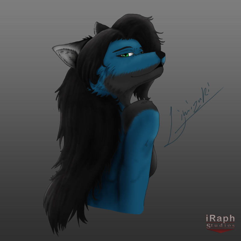
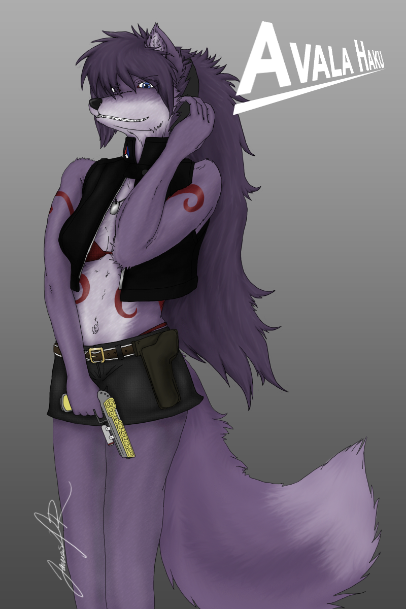
The “Sexy Baby” one has the illusion, of the girl having a beard, hence the gray fur, yet, that’s probably one of your best art pieces! By the way, do you have a FA page?
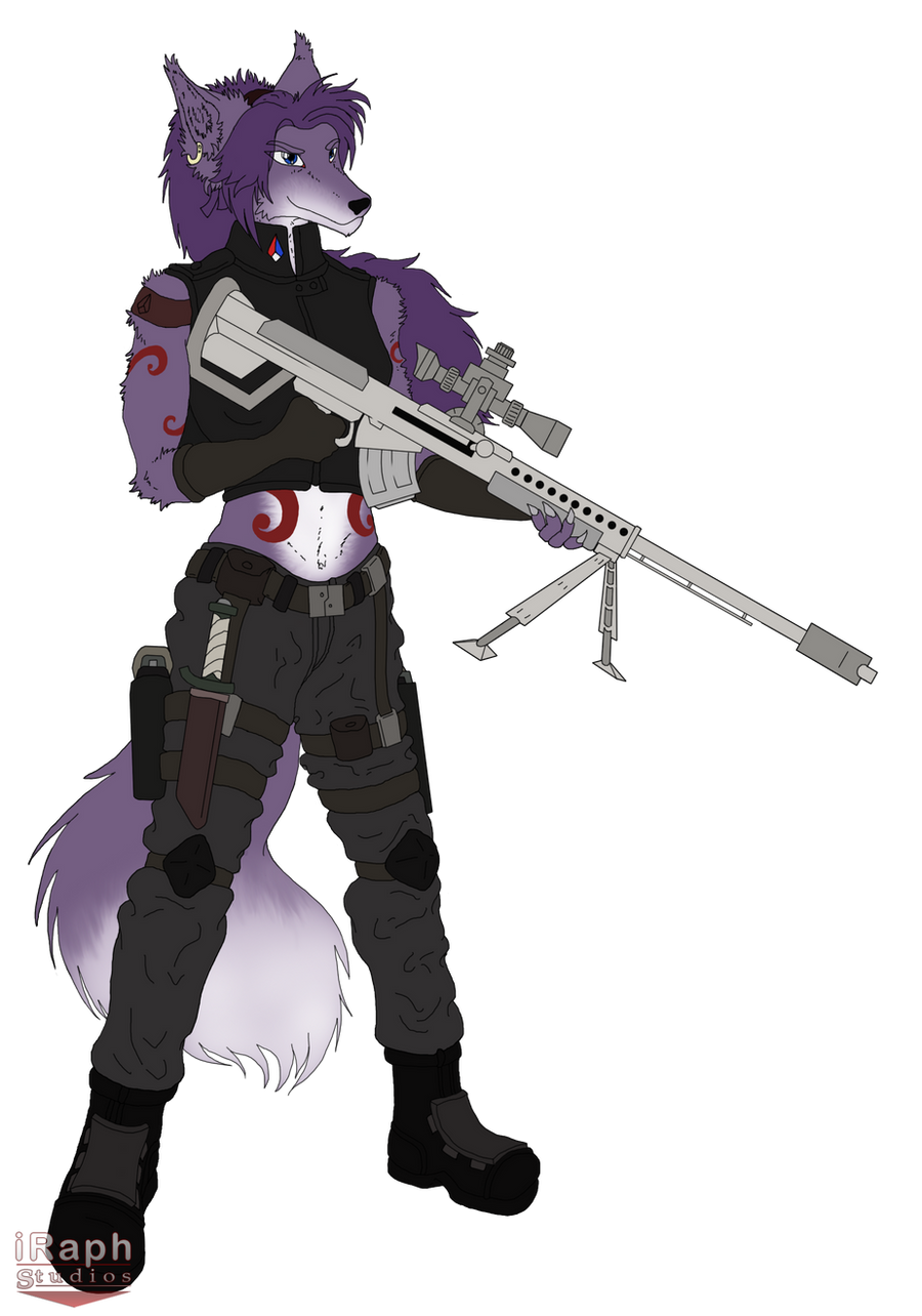
You rely a lot on your outlines, and that’s at the cost of the shading, which is quite blurry and quite bland. Think about the quality of the light, there are so many different kinds of lights you can emulate!
Consider and practice ways of shading fur and material too, it’ll make your work sevenfold better.
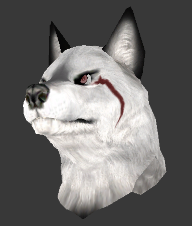
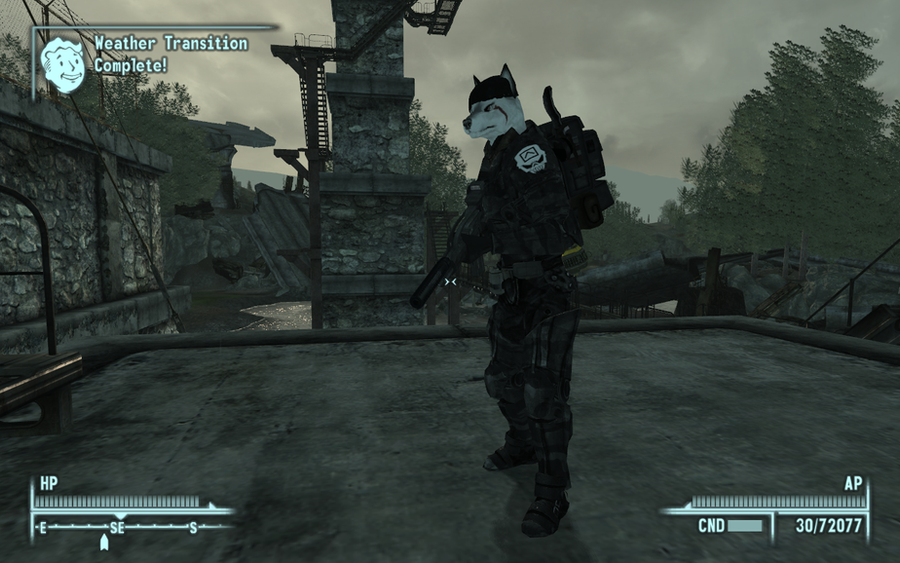
Nice. Now you’re posting 3D stuff too. Is that a new hobby of yours or something you’re experienced with? At any rate the 3D model (along with your drawings) looks pretty good.