I would have posted these yesterday, but the server was down or something. Anyway, i finished my Sylux sprite running animation. Tell me what you think, id like to perfect it before i make the other aiming.
And here’s whats complete of the sprite sheet.
I thought there might be too many light colors on the sheet, tell me what you think.
Double posting, thanks for making me do it. Anyway, heres my complete Sylux sprite sheet. Please tell me what you think. Someof the animations still need to be smoothed out, but other than that, i think it looks great. If you want to help with the lockjaw sprites, Email me at Harkalbatross@aol.com.
In other news, i think im the first person to sprite the new bounty hunter from MP3, Rundus. I had them recolored by Metroidman for accuracy, but i think they’re pretty nice. Tell me what you think.
Constructive comments, and Email me if you want to help!!
Thanks, i did think my colors looked more like the real thing, but i feel i didnt use enough blue tint. Anyway, can someone get me some links to in game shots of Weavel. After remaking Sylux, id really like to do Weavel too (plus Nsiders at Nintendo are begging me). Front, back, and Side pics, plus half turret sprites. The official art isnt very accurate.
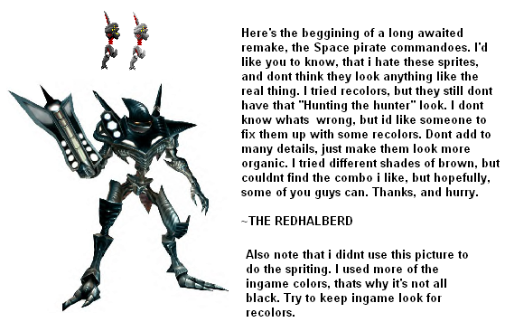
Aaaaarg, probably my millionth double post. Anyway, ive been working on my (much needed to be improved) space pirate commando sprites. I started the remake, and i already dont like it. The colors look to mechanical, and dont feel organic enough. Can someone help me? Mabye just a little recolor would do the trick. Try not to add to much detail, i havent really started it yet, but make them feel more alive.
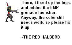
The image link is gone because i updated it. I still feel it needs recoloring, but i like it alot better now. I added the cannon, and improved the legs. I still need someone to fix it. THanks
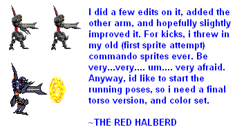
Err, that center part of his body = no.
Also, he’ll need an outline of some sort, I think…
Other than that, he’s okay… ish. I don’t really like him, though, to be honest.
Maybe Dazzy can give you some pro tips. >>;
<<;
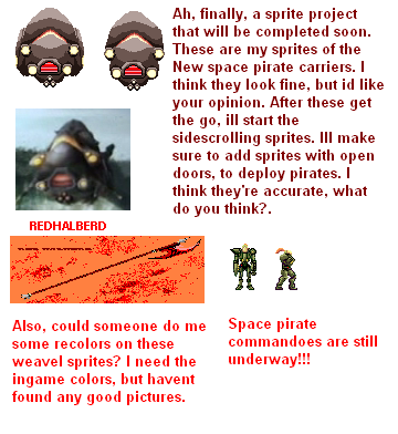
Thats not the update though, the link hasnt changed yet, ill fix it up. Check the forums later, they should be right. Anyway, i started an all new project (i promise ill finish the old ones)!!! Here are my sprites of the new pirate ships from Prime 3.
I havent started the 2d sprites yet, but i will, as soon as i get the feedback from these ones. Until that, tell me what you think.
You just confused me even more. Is there too much contrast, or not enough shading?? Or are the shading colors to similar, or are they too different. Please clear up. Ive added too it, but i dont get your meaning.


 [
[
![http://i56.photobucket.com/albums/g192/REDHALBERD/Sprites/Rundussprites2.png[/img]](http://i56.photobucket.com/albums/g192/REDHALBERD/Sprites/Rundussprites2.png%5B/img%5D)